VÉLI — Beauty for the Moment
VÉLI is a conceptual premium body-care brand designed around the idea that everyday rituals deserve more attention.
Project Snapshot
Role: Creative Director / Brand & Packaging Designer
Focus: Brand Strategy, Visual Identity, Packaging, Art Direction & Campaign Development
Scope: Naming · Identity · Packaging · Product System · Photography · UGC · Retail · Digital
Category: Premium Body Care / Beauty
Project Type: Self-initiated Concept Project
The Brief / Challenge
Making the everyday feel worth noticing.
Body wash is an everyday essential, but the category is filled with familiar shapes, predictable colour systems and functional messaging.
The challenge was to create a body-care brand that could feel premium without becoming precious, playful without becoming childish, and expressive without becoming visually chaotic.
VÉLI needed to work not only as a bottle on a bathroom shelf, but as a recognisable brand across physical, digital and social environments.
VÉLI — Beauty for the Moment
Create a contemporary body-care brand that:
- makes everyday rituals feel more intentional
- has a recognisable physical product signature
- balances premium design with personality
- creates an emotional connection beyond functional benefits
- scales naturally across products, campaigns and digital touchpoints
The Insight
People don’t only remember what a product does.
They remember how it makes a moment feel.
A shower can be a reset before a busy day, a slow ritual at night, or five minutes of quiet in between everything else.
This became the opportunity for VÉLI:
Instead of positioning body care as another task, position it as a moment.
The brand therefore focuses less on perfection and more on mood, atmosphere and small everyday pleasures.
BEAUTY FOR THE MOMENT.
VÉLI was built around one simple thought:
Everyday beauty doesn’t need a special occasion.
The brand turns ordinary routines into small sensory experiences — a warm shower, fresh skin, sunlight through the bathroom window, the scent that stays after you’ve left the room.
This idea shaped everything from the product names to the packaging colours, photography and social content.
Creative principle
QUIET STRUCTURE. LOUD MOMENTS.
The identity provides a disciplined, minimal framework. Colour, photography, scent and copy create the moments of expression within it.
Brand Personality
VÉLI sits between refined and playful.
It doesn’t behave like a traditional luxury beauty brand, but it also avoids the overly casual language common in mass-market body care.
VÉLI is:
Refined
Clean, considered and visually precise.
Sensory
Built around scent, texture, skin, water and atmosphere.
Playful
Confident enough to have a little fun.
Expressive
Colour and imagery carry emotion.
Contemporary
Designed for modern beauty culture and social environments.
Uncomplicated
Clear language. Clear products. No unnecessary complexity.
VÉLI is not:
Clinical.
Overly wellness-focused.
Traditional luxury.
Childlike.
Over-designed.
Visual Direction
Quiet structure. Loud moments.
The visual system begins with a restrained foundation and introduces colour through the product and imagery.
Bone and Ink establish the quiet base.
Tomato, Cherry and Lime create the energy.
Photography introduces the sensory layer through:
Skin · Water · Light · Texture · Fruit · Glass · Stone · Reflection
The result is a visual world that feels premium, tactile and contemporary, while still having enough personality to stand out on a crowded shelf or social feed.
Colour System
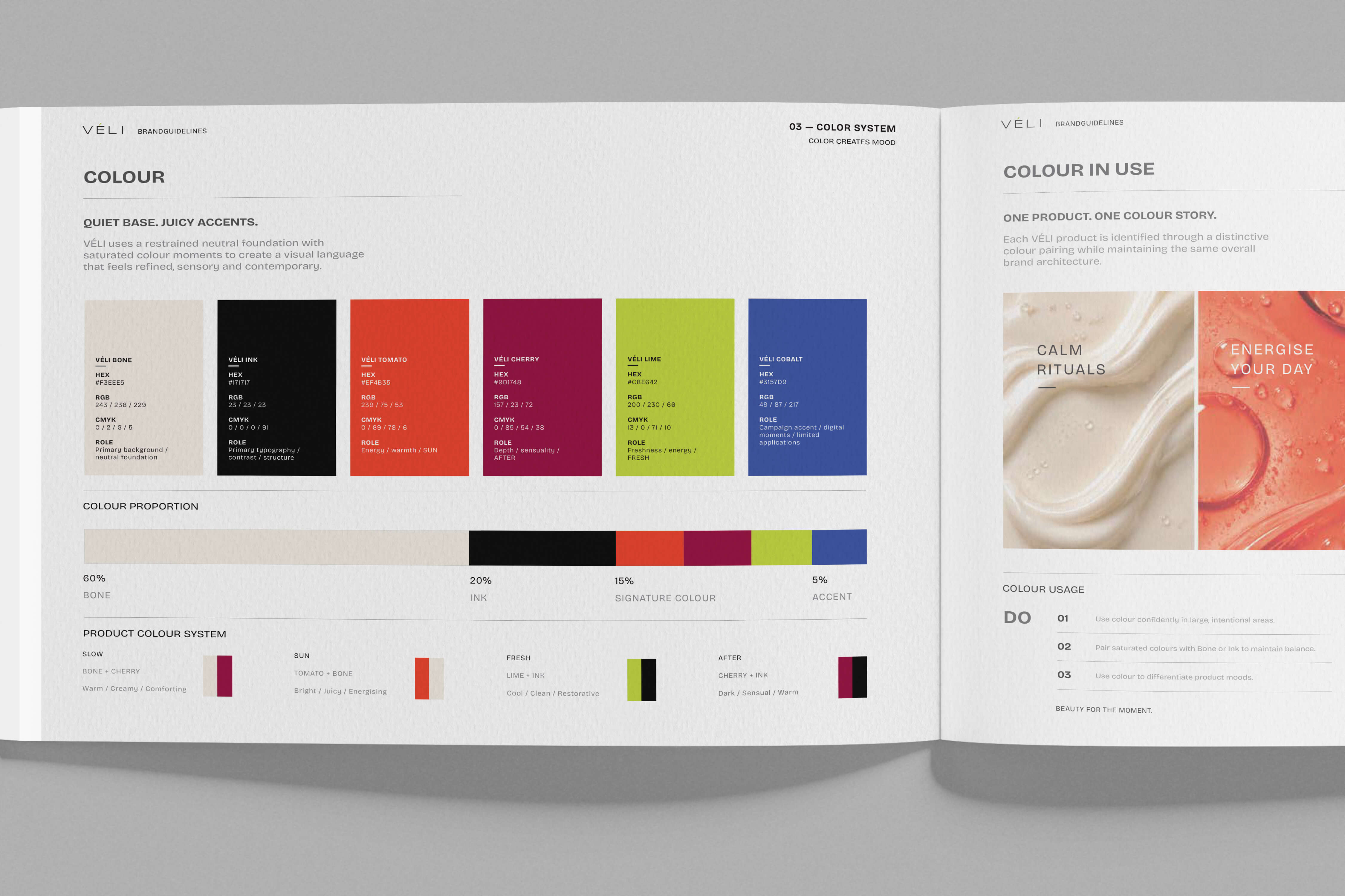
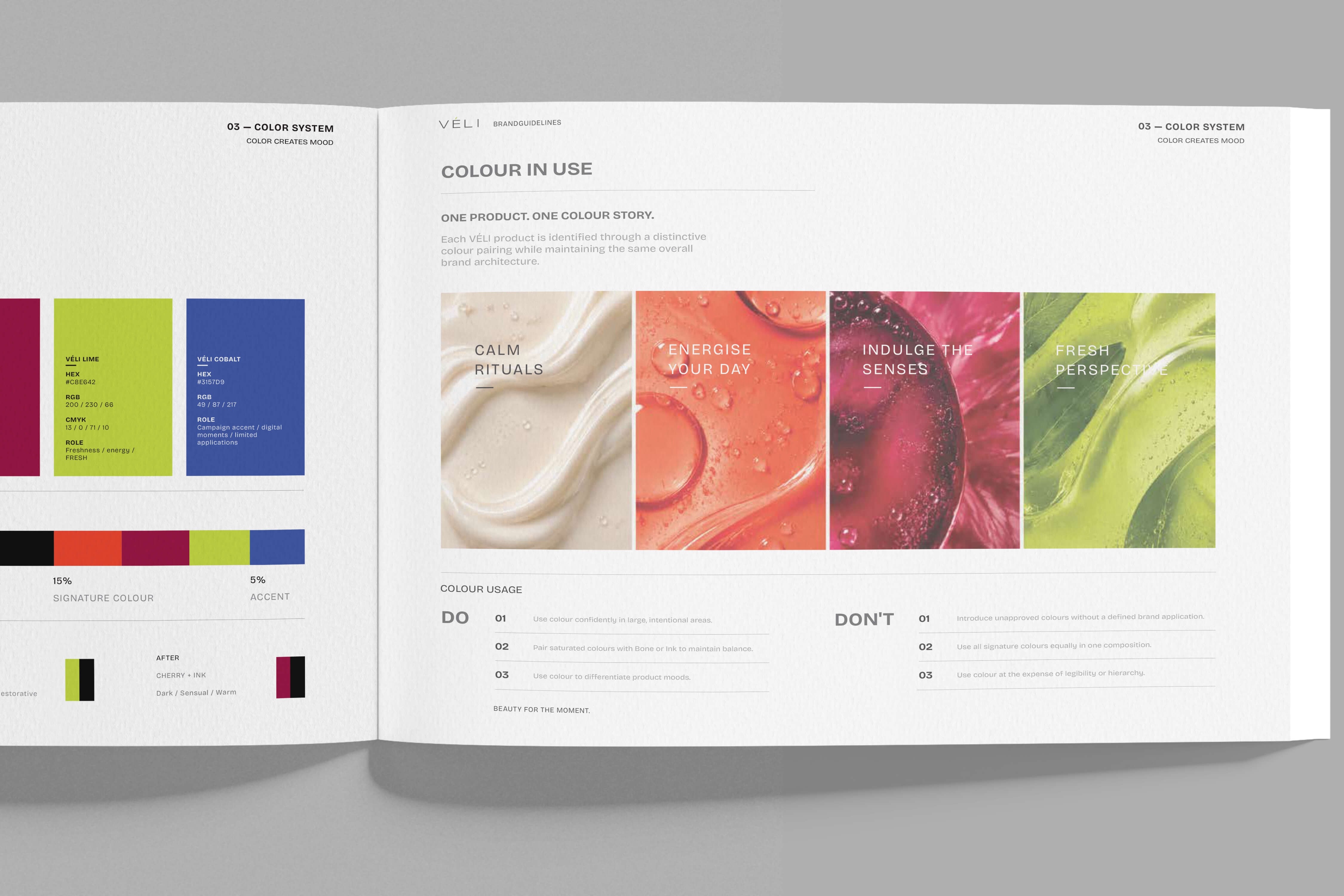
QUIET BASE + JUICY ACCENTS
The colour system was designed to give VÉLI a recognisable visual language while allowing each product to own its own mood.
Typography & Wordmark
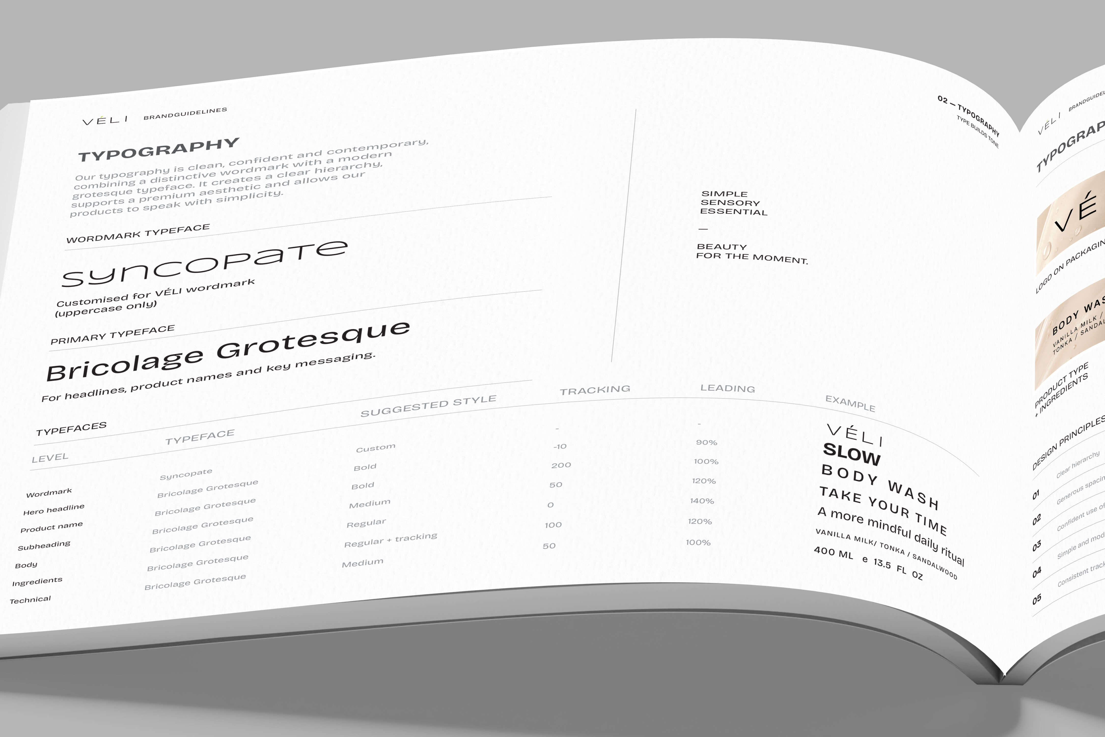
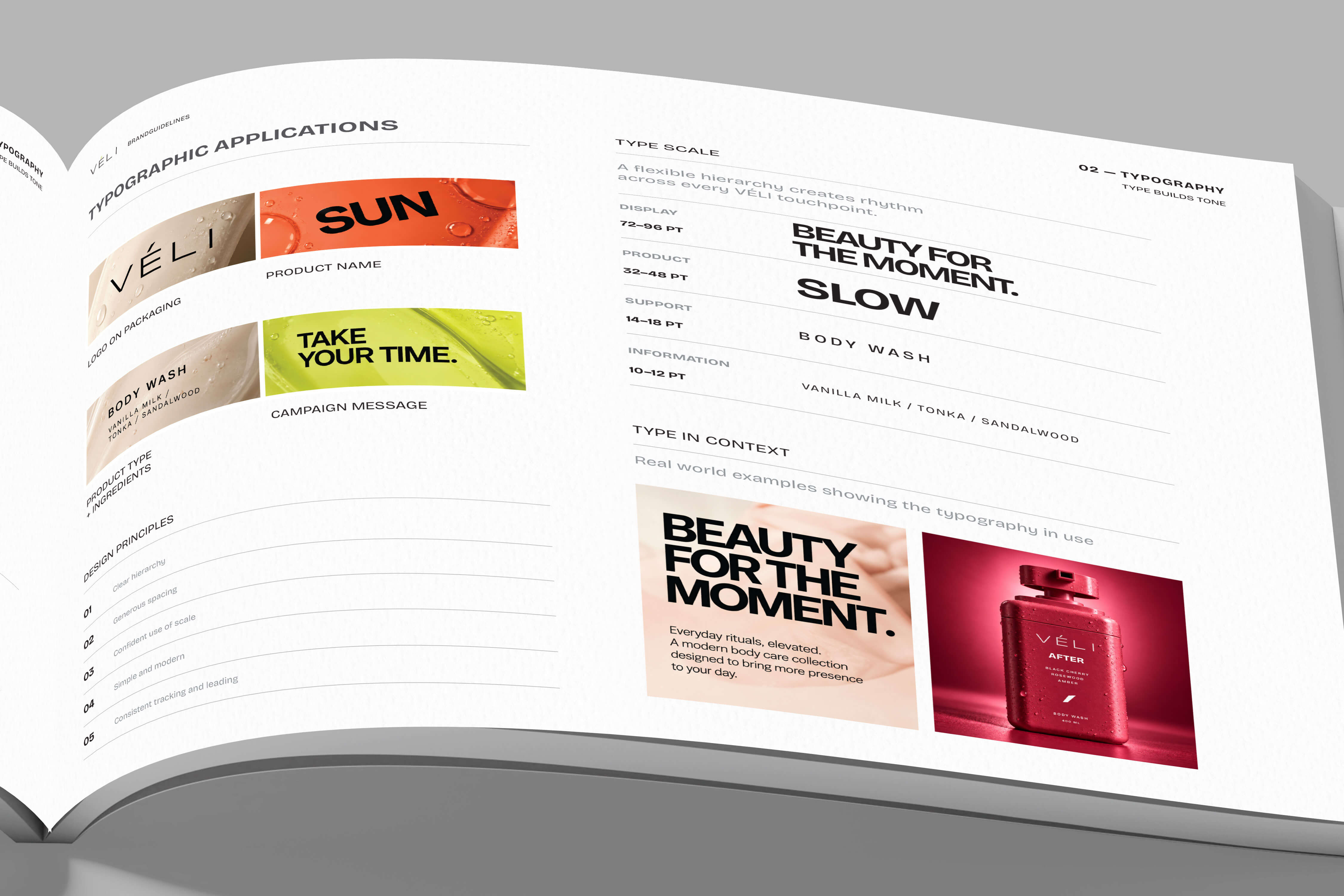
VÉLI uses a contemporary grotesk foundation to create a visual language that feels clean, premium and approachable.
The typography is deliberately restrained so that colour, product form and imagery can create the expression.
Wordmark
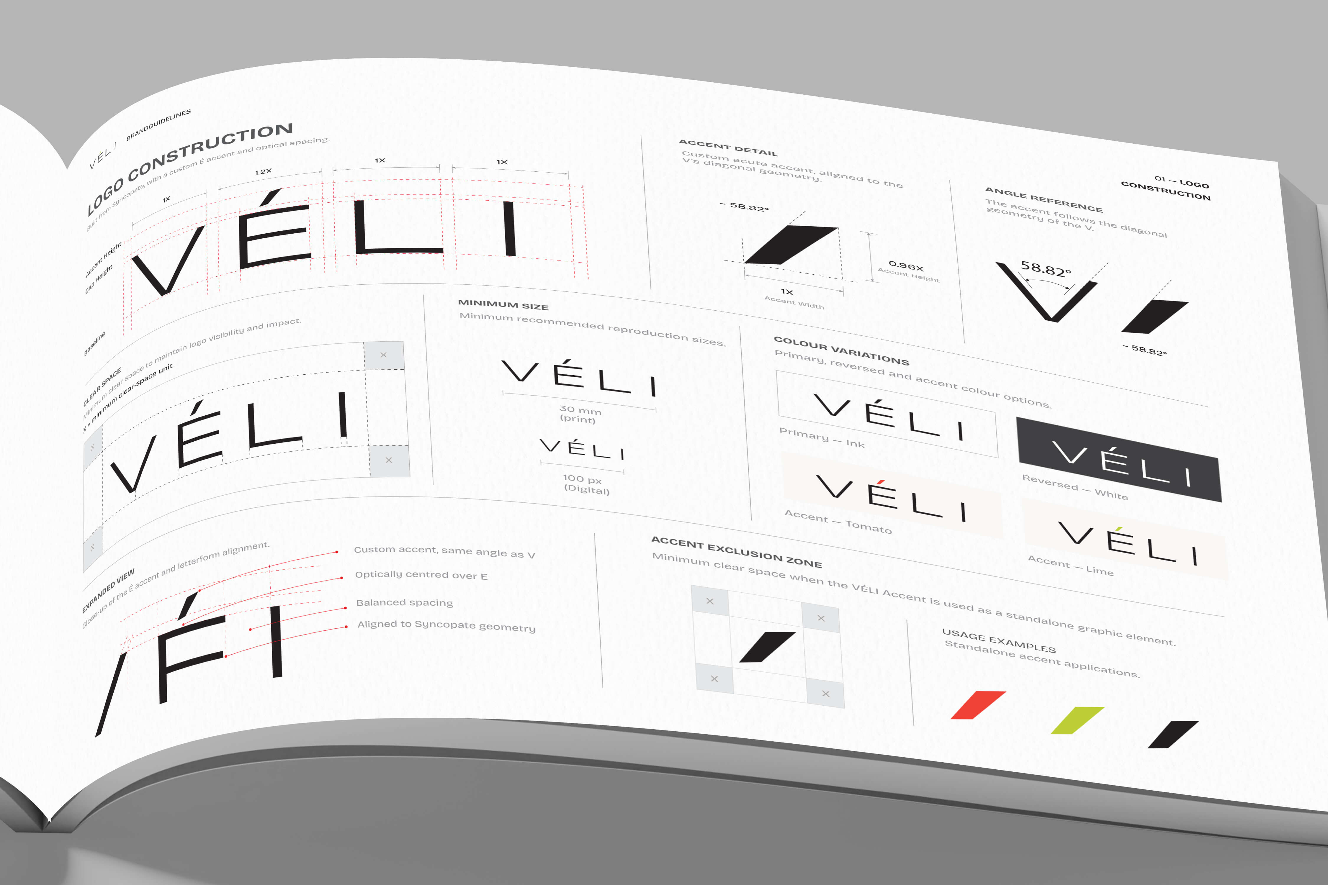
The VÉLI wordmark is built around:
- generous spacing
- lightweight geometric forms
- a distinctive É
- carefully controlled proportions
- a precise diagonal accent
The VÉLI Accent
The diagonal stroke derived from the É becomes a subtle recurring brand element.
Rather than functioning as a separate logo, it can appear as a graphic mark, divider, detail or embossed element across selected applications.
This gives the identity a recognisable visual signature without requiring an additional symbol.
Packaging Architecture
Turning the bottle into a brand signature.
The bottle was treated as more than a container.
The goal was to create a form that feels:
recognisable · comfortable · displayable · portable · tactile
A wide rounded-rectangle silhouette gives the bottle a strong shelf presence while maintaining a compact footprint.
Product Range
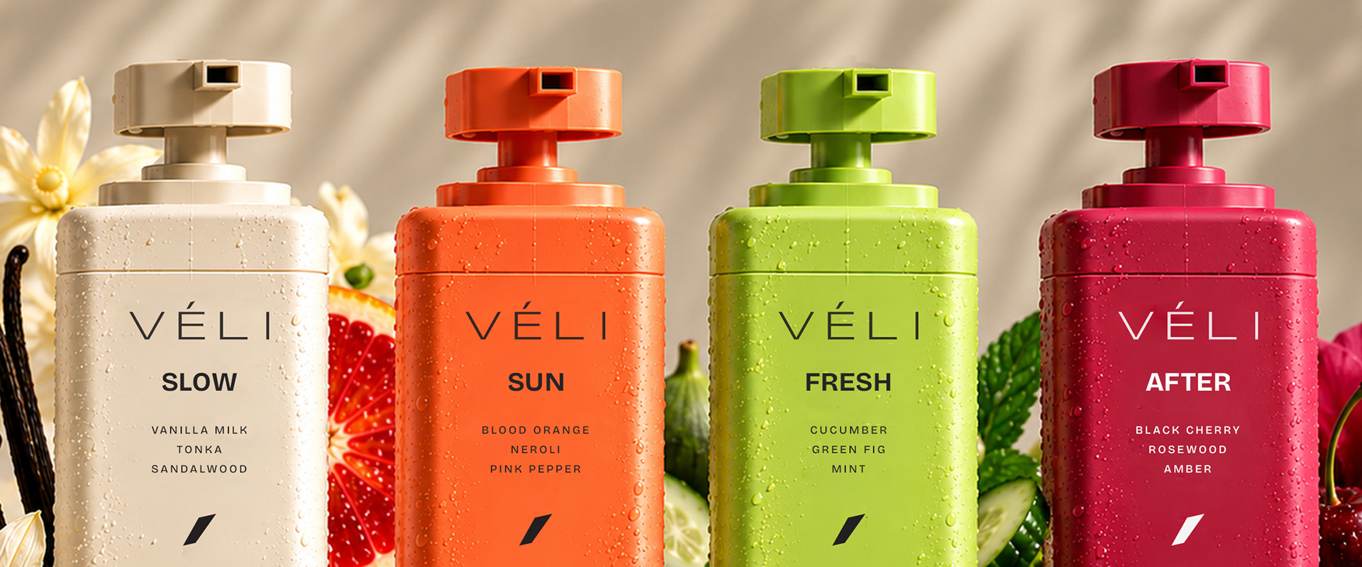
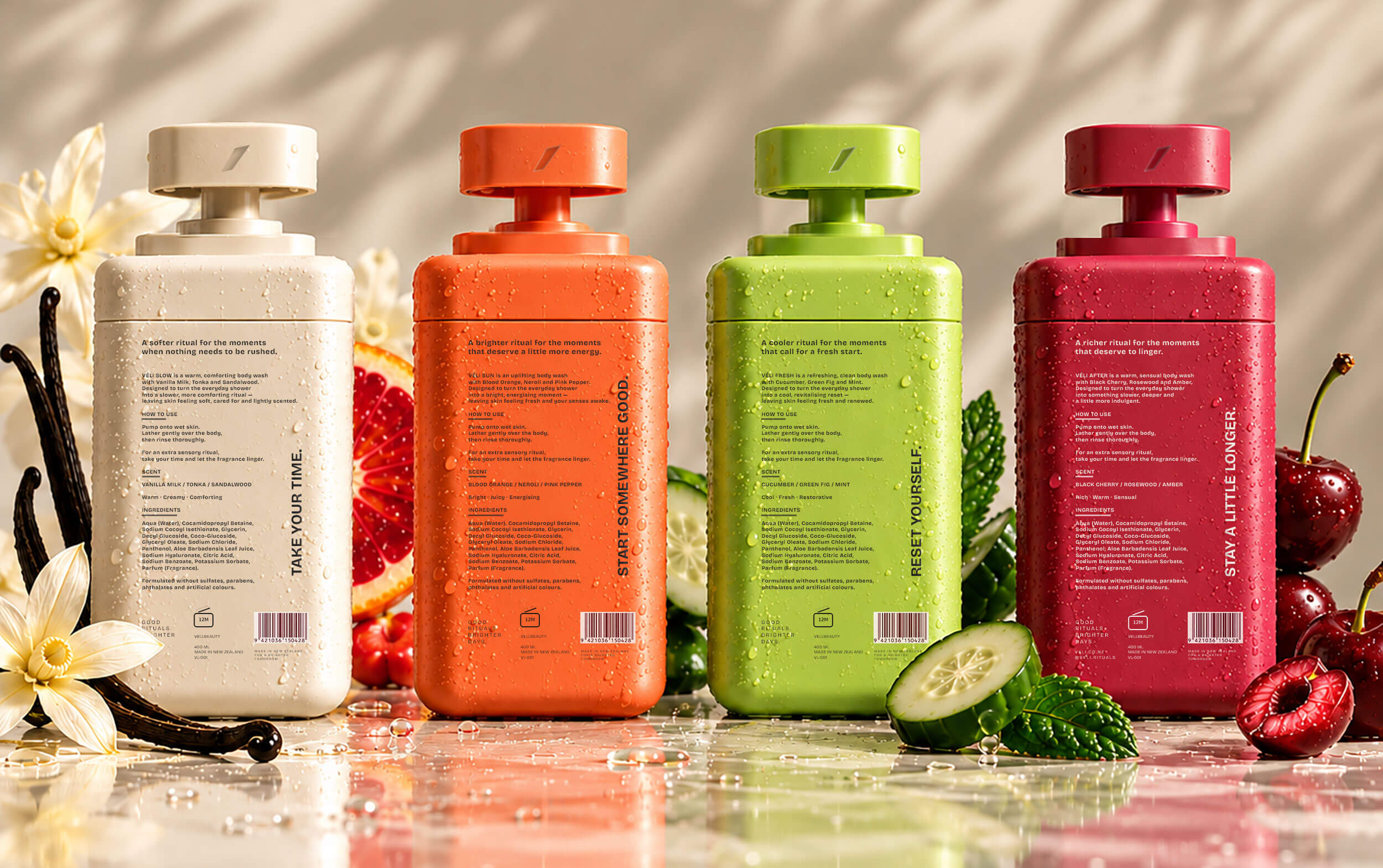
Four moods. One ritual.
VÉLI uses scent and colour to give each product a distinct emotional identity.

Art Direction
THE OBJECT. THE BODY. THE MOMENT.
VÉLI's art direction is built around three visual worlds.
THE OBJECT
The bottle becomes a sculptural object.
Glass, chrome, stone, water, reflections and tactile surfaces create premium product compositions.
THE BODY
Skin, hands, shoulders, wet hair and movement bring the product into a human context.
THE MOMENT
The world around the ritual becomes part of the story — getting ready, stepping outside, slowing down, resetting and going somewhere.
Together, these three worlds prevent VÉLI from feeling like a traditional product catalogue.
Campaign
Product photography with a point of view.
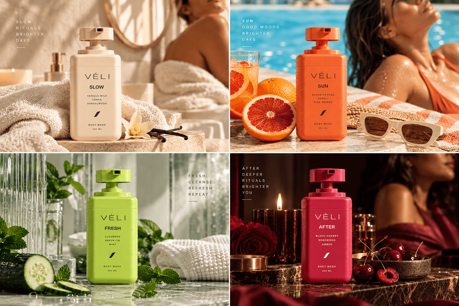
The campaign imagery uses light, colour and materiality to express the emotional character of each product.
SLOW lives in warm, creamy textures.
SUN uses sunlight, poolside environments and citrus energy.
FRESH explores water, glass, green textures and cool surfaces.
AFTER moves into deeper cherry tones, evening light and richer materials.
The photography is intentionally tactile.
You should almost be able to feel the product through the image.