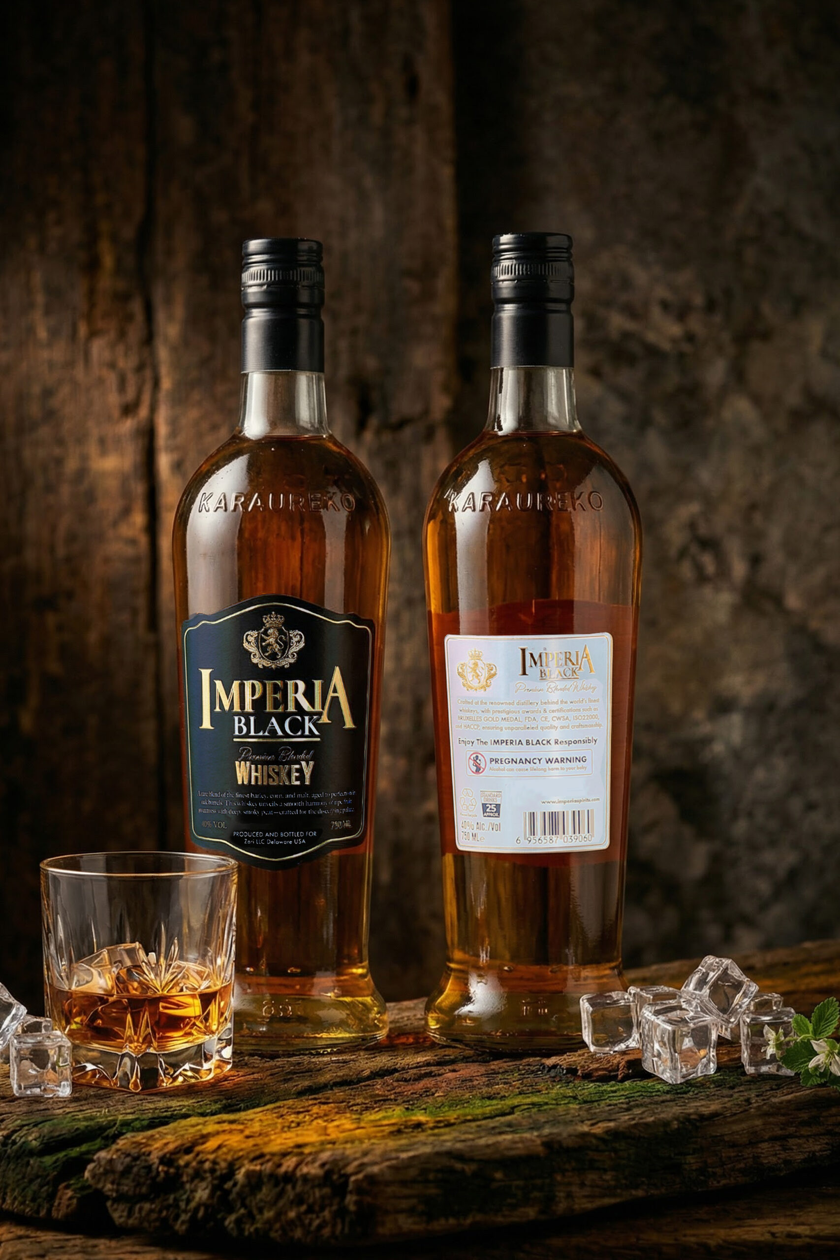
IMPERIA BLACK Premium Whiskey Brand
Strategically positioned at the lower threshold of the premium tier, combining luxury-coded aesthetics with scalable global production.
Project Snapshot
Brand: Imperia Black Premium Whisky
Category: Premium Value Whisky / Spirits
Positioning: Globally inspired premium whisky balancing heritage-coded luxury aesthetics with scalable international production.
Target Markets: USA, Australia, Asia, Middle East
Retail Positioning: USD $50–60 premium tier
Role: Brand Strategy, Visual Identity, Packaging Design, Brand Narrative, Print & Collateral Systems
Core Deliverables
Bottle Label System
Packaging Architecture
Brand Story Framework
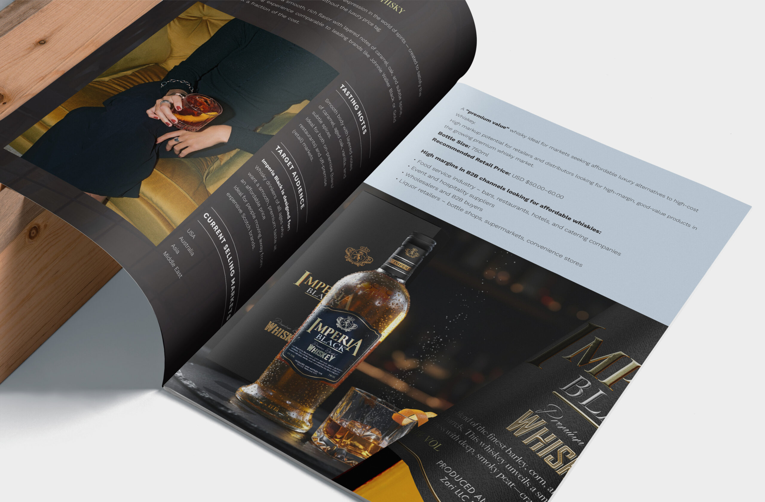
Export-Focused Brochure
Visual Asset System
Strategic Focus
Premiumisation alignment
Luxury semiotics
Distributor confidence signaling
Global compliance positioning
Scalable brand system design
Market Research & Positioning Strategy
Category Context
The global whisky market has experienced sustained premiumisation, with consumers increasingly trading up from standard blends to premium and super-premium offerings. Established brands such as Johnnie Walker Black, Chivas Regal 12, and Jameson dominate the accessible premium tier, typically positioned between USD $40–65.
At the higher end, luxury Scotch brands command significantly higher price points, leveraging heritage, craftsmanship, and legacy narratives.
Within this landscape, a strategic opportunity emerged:
A premium-looking whisky positioned at the lower threshold of the premium tier — delivering luxury perception while maintaining distributor-friendly margins.
Imperia Black was designed to occupy this space.
Competitive & Semiotic Research
Rather than designing in isolation, the visual system was informed by category benchmarking and luxury semiotic analysis.
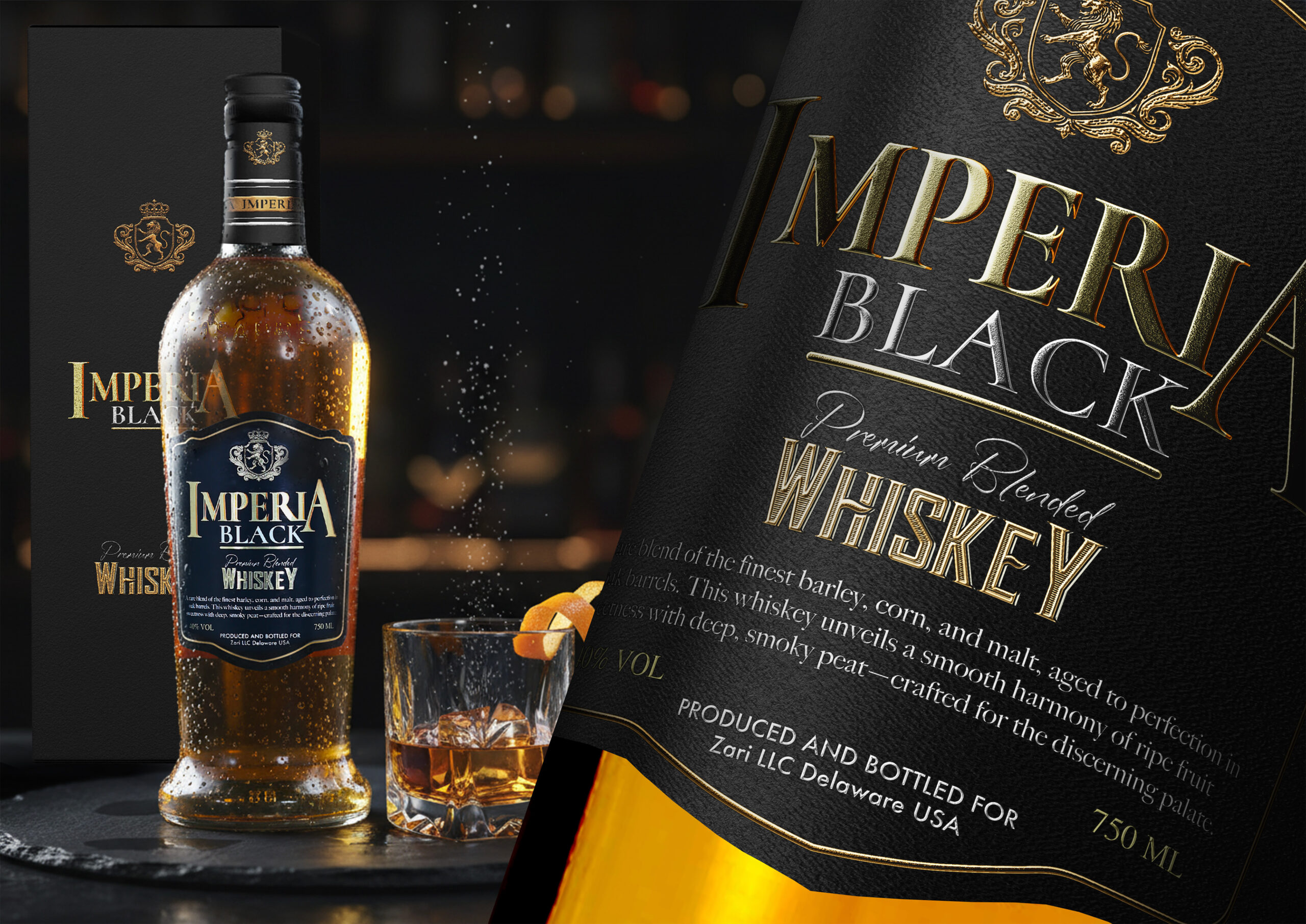
A review of leading premium whisky brands revealed consistent visual signals associated with trust and prestige:
- Heraldic crests and emblems
- Structured shield-shaped labels
- Serif typography rooted in tradition
- Black and deep navy palettes
- Metallic gold accents
- Minimal yet authoritative information hierarchy
These visual cues operate as shorthand for heritage, craftsmanship, and authenticity.
The strategy was not to disrupt these category codes, but to align with them intentionally — ensuring immediate premium recognition at shelf level.
Defining Luxury in Context
Luxury within the whisky category is rarely expressed through excess. Instead, it is communicated through restraint, proportion, and material hierarchy.
Research into premium beverage branding highlighted three dominant signals:
1. Color & Contrast
Black paired with metallic gold consistently communicates exclusivity and prestige while maximizing shelf impact.
2. Typography & Structure
Classical serif typefaces evoke legacy and authority. Clear typographic hierarchy reinforces confidence.
3. Symbolism & Form
Crests and structured label shapes signal lineage and trust, even within emerging brands.
These insights directly informed the Imperia Black identity system — from label architecture to typographic scale and color strategy.
Strategic Tension
A key positioning challenge lay in origin perception.
While many premium whisky brands emphasize Scottish heritage, Imperia Black is distilled and bottled in a modern, export-ready facility in China
Rather than positioning this as a limitation, the strategy reframed it as an advantage.
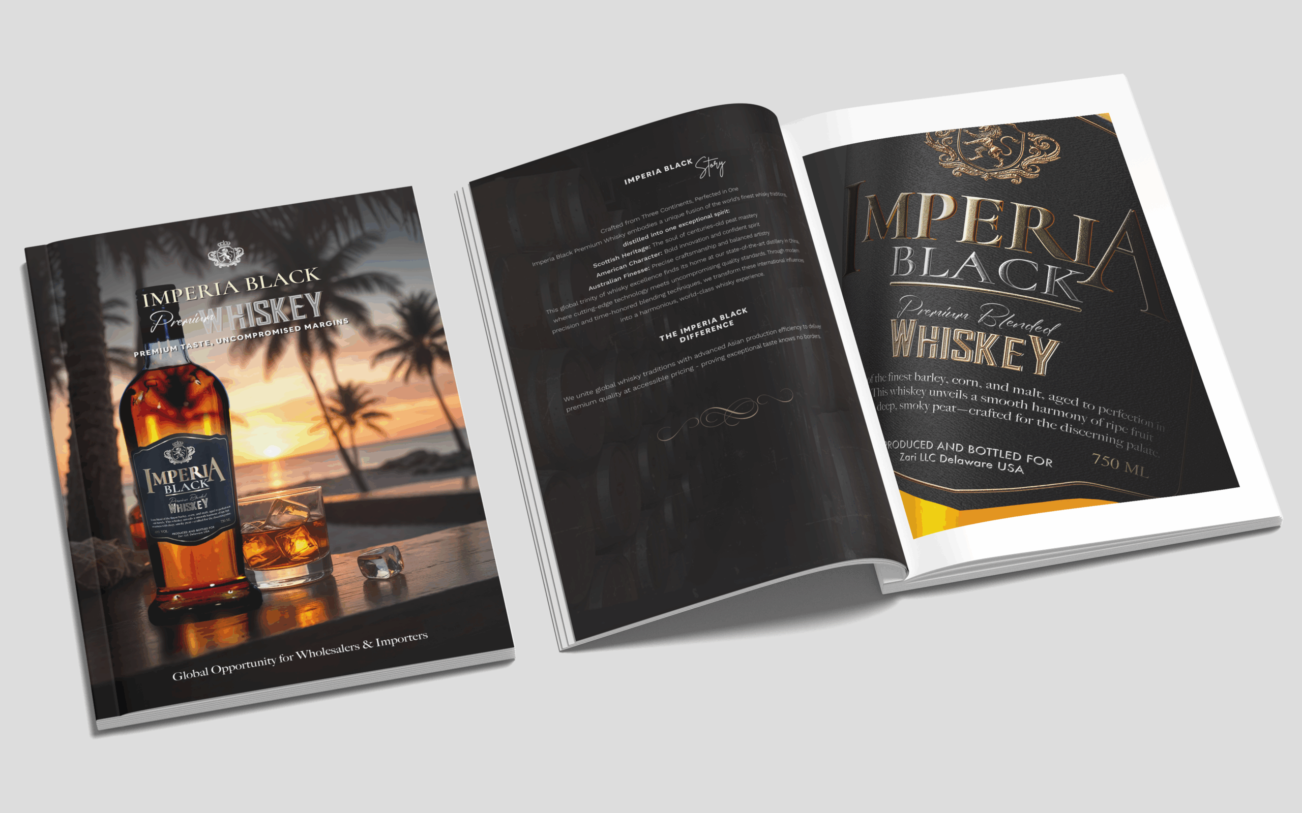
The narrative “Crafted from Three Continents, Perfected in One” blends:
- Scottish heritage
- American boldness
- Australian finesse
- Asian production precision
This reframing integrates global tradition with scalable modern production — supporting both premium perception and international distribution credibility.

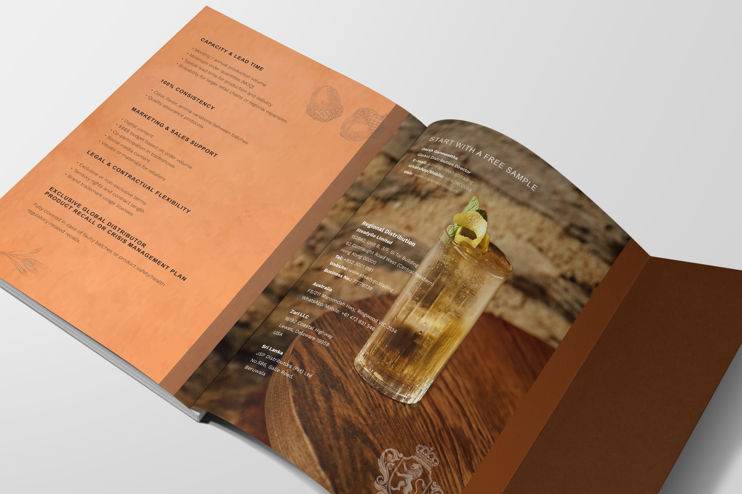
Commercial & Distribution Considerations
The brand was developed not only for consumer appeal, but for distributor confidence.
The brochure highlights:
- USD $50–60 recommended retail positioning
- Global target markets including USA, Australia, Asia, and the Middle East
- International certifications and compliance infrastructure
- High-volume container scalability (10,000 bottles per 20ft container)
These commercial realities informed a brand system that needed to signal:
- Stability
- International readiness
- Premium quality
- Operational reliability
The visual identity therefore functions as both a consumer-facing luxury cue and a B2B trust mechanism.
Positioning Outcome
Imperia Black was positioned as:
A globally inspired premium-value whisky that leverages established luxury codes while enabling scalable production and international distribution.
The result is a brand system grounded in research, aligned with category expectations, and structured for commercial growth.